
Component Details
Hero Component 01
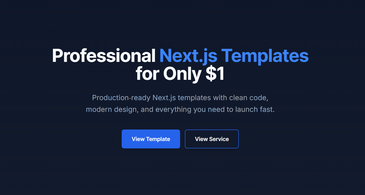
HeroSection.tsx
Next.js•Tailwind CSS
1import Link from "next/link";
2
3export function HeroSection() {
4  return (
5    <section className="py-20 md:py-32 lg:py-40 bg-gradient-to-b from-background to-secondary/20">
6      <div className="max-w-7xl mx-auto px-4 sm:px-6 lg:px-8">
7        <div className="max-w-4xl mx-auto text-center space-y-8">
8          <h1 className="text-5xl sm:text-5xl md:text-6xl font-bold tracking-tight">
9            Professional{" "}
10            <span className="text-primary">Next.js Templates</span>
11          </h1>
12
13          <p className="text-2xl text-muted-foreground max-w-2xl mx-auto leading-relaxed">
14            Production-ready Next.js templates with clean code, modern design,
15            and everything you need to launch fast.
16          </p>
17
18          <div className="flex flex-col sm:flex-row gap-4 justify-center items-center pt-4">
19            <Link href="/template" className="w-full sm:w-auto">
20              <button
21                type="button"
22                className="w-full sm:w-auto inline-flex items-center justify-center px-8 py-4 text-lg font-semibold rounded-lg border-2 border-blue-600 bg-blue-600 text-white transition-all shadow-lg hover:shadow-xl hover:bg-blue-700 hover:border-blue-700"
23              >
24                View Template
25              </button>
26            </Link>
27
28            <Link href="/service" className="w-full sm:w-auto">
29              <button
30                type="button"
31                className="w-full sm:w-auto inline-flex items-center justify-center px-8 py-4 text-lg font-semibold rounded-lg border-2 border-blue-600 text-blue-600 transition-all shadow-lg hover:shadow-xl hover:bg-blue-600 hover:text-white"
32              >
33                View Service
34              </button>
35            </Link>
36          </div>
37        </div>
38      </div>
39    </section>
40  );
41}
42